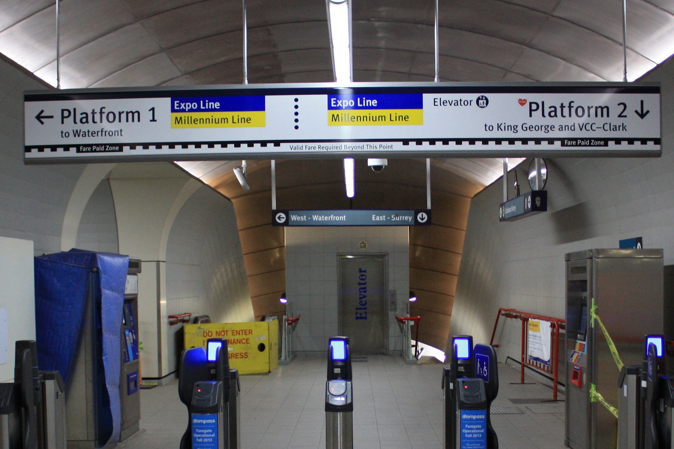
I was going through some of my photos and came across a set where I was comparing old and new signage on the SkyTrain. Below is one example from Granville Station. You can see the new sign in the foreground, with the existing sign further back. What struck me is how complex the information is on the new sign. The primary emphasis (judging from the size of the text) of the new platform signs is placed on the platform numbers, as opposed to the direction of travel as is in the old sign. In fact, the direction of travel isn’t Continue Reading

