What better to do on a 12-hour flight than to explore the in-flight entertainment (IFE) system looking at ways that it can be made better. Having completed CPSC 344 (Human-Computer Interaction) last term, I have an even more eager eye looking at interface usability. So here are some things I found about Air Canada’s IFE interface.
Movie Category Selection
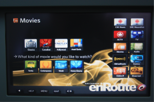
When I got to this screen initially, I thought there were only four categories of movies (the buttons below the question). However, looking more closely at all the buttons, I figured out that the buttons above the question also were categories.

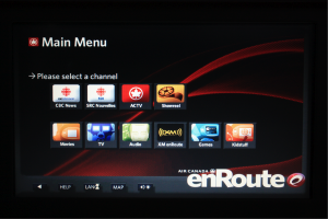
This screen breaks consistency that most people would expect by having possible answers to the question below the question itself. It is also different from other screens such as the main menu which lists all possible choices under the instruction.
This inconsistency can be fixed by moving the question/instruction up to the top before all the selections. At least for me that would make it more clear.
Let’s look at another screen.
Movie Selection Screen
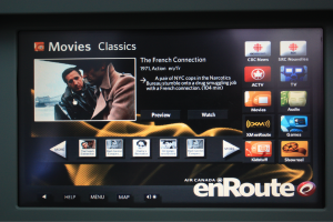
This is another screen where I found a potential problem. The “More” buttons on either side of the thumbnail selection allow scrolling through the list. The list of thumbnails loops so both “More” buttons always appears. This isn’t a problem if the number of thumbnails is not divisible by 5 as you can note the last page by having 4 or fewer thumbnails. But in the case that the number of thumbnails is evenly divisible by 5, it is very difficult to tell whether you have reached the end of the list and are repeating back to the beginning. The titles are not in alphabetical order (which also increases the difficulty in locating a certain video.
This issue could easily be remedied by having page indicator dots below the thumbnail list (Apple style). This would make it easy to tell which page you are on and how many pages there are to scroll through.
As for the menu bar on the right side of most screens, I would have given a little more separation of the button appearance compared to the option buttons given on the page so that it is very clear that the buttons on the right are part of the main menu and not the options on the current page. Also, at first I thought having the main menu on the right was strange (I guess I was used to menus either being at the top or on the left) but then I realized that it was probably catering to the right-handedness of most people. It would be much easier for most passengers to tap on buttons on the right side than to cross over to the left.
All in all, the interface wasn’t too bad. A few things bugged me, but overall it was quite easy to use.
The flight itself was great. Thankfully our pilot didn’t call in sick. I’m currently in China and will be in Hong Kong next week.


So which movie did you end up watching? 😛
The Score