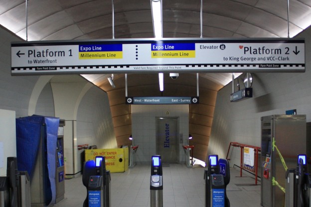
I was going through some of my photos and came across a set where I was comparing old and new signage on the SkyTrain. Below is one example from Granville Station. You can see the new sign in the foreground, with the existing sign further back. What struck me is how complex the information is on the new sign.

The primary emphasis (judging from the size of the text) of the new platform signs is placed on the platform numbers, as opposed to the direction of travel as is in the old sign. In fact, the direction of travel isn’t even on the new sign at all.
I remembered reading the following guideline some months ago from an old New York City Transit Authority Graphics Standards Manual circa 1970.
The subway rider should be given only information at the point of decision. Never before. Never after.
The decision to be made at the faregates is whether I want to cross the faregates or not. The information about the direction of the platforms is presented too early to the rider. The information that I’d expect to see above the faregates to help me with that decision would be something along the lines of “To Trains – Expo & Millennium Lines – Westbound to Downtown; Eastbound to Burnaby, New Westminster, Surrey“. This indicates that there are trains are behind the gates, which lines they run on, and where I could possibly go from here. The information about the specific platforms doesn’t need to be shown at the point of the faregates.
After that, at the intersection where the old sign is, the rider can be shown information on the different platforms and destinations. However, it would make more sense to me to emphasize the direction of travel, and the destination instead of the platform number, especially since most stations only have two platforms. Platform numbers are only be useful for people following a trip plan, or if there are two or more lines at a station; they aren’t really useful in any other circumstance.
The effect of giving people information too early can also be seen on the signage at Burrard Station, depicted below.

There should actually be two decision points: one at the faregates whether to enter or not, and the second one at the intersection of the corridors to decide which train to take. Since platform directions are given at the decision point of the faregates, the arrows pointing to the platforms go in all different directions. The existing signs above the corridors to each of the platforms is the correct decision point (whether to enter into the corridor or not) to give platform information.
The guideline in the old NYCTA Graphic Standards manual makes a lot of sense to me now. Putting relevant information only at the decision point makes signs less cluttered with information.


Did you know TL actually has a wayfinding strategy? It’s a 165 page long document with tons of detail on everything from signage design to how signage “layers” on how to best direct people. I wrote about it 8 months ago: http://257vancouver.wordpress.com/2012/06/05/my-comments-on-translinks-wayfinding-strategy/